
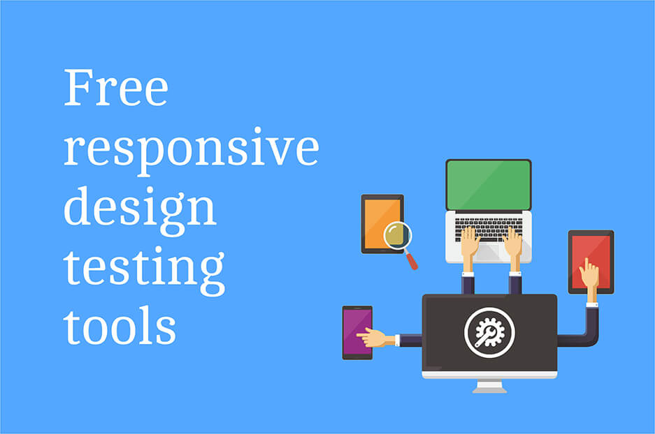
Most web designers know the importance and benefits of responsive design. If you have chosen to convert your online project into a responsive one. It will be necessary to test the screens of the different devices (desktop, laptops, tablets, Smartphone’s) during the development process. These responsive website test must be carried out, at the latest, during the final phase of implementation. In order to extensively determine errors and inconsistencies that may arise in the future. Below we present 8 web design tools to check if your website is responsive.
Responsive test from the browser
All the tools that we present below are run in the browser and can be used for free without registration. Seven of the eight applications exposed are very easy to use web apps. You just need to enter the URL of the responsive web that you want to check and the tool takes care of everything else. These web applications simulate the representation of a web page in one or several screens and allow you to navigate through it as if you were doing it from the browser. Thus, these web design tools not only allow the display of the home page. But also facilitate navigation in different resolutions.
Mozilla Firefox Tool
If you use Firefox as a web browser, it is quite easy to check if your website is responsive. In the navigation menu, click on the “Web Developer” option and then on “Adaptive Design View” or use the keyboard combination [Ctrl] + [Shift] + [M]. The web page will be display on a black background and in the upper left, you can choose the preset screen size of the responsive test. You can also change the resolution by enlarging or reducing the frame of the corners with your mouse.
Screenfly
This web application tests the responsive design of a web using a wide range of standard resolutions represented by the icons at the bottom of the browser’s address bar. The options include desktop screens, tablets, Smartphone and TVs. Screenfly also allows you to check individual resolutions, which makes it a particularly versatile application.
Responsivepx
This tool works in a similar way to Screenfly. Responsivepx allows you to expand the width and height of the virtual screen to a maximum of 3,000 pixels.
Cyber Crab Screencheck
Another very flexible application to perform a responsive test is Screencheck was programmed by software developers of cybercrab.com and can be used directly from its website.
Google Resizer
In the main page of the Google test tool, the web is displayed in three different sizes (desktop, for tablets and Smartphone’s). Google Resize is also compatible with other resolutions in landscape (480 – 1600 pixels) and vertical (360 – 1024 pixels). Compared with other applications, the range of screen sizes for a comprehensive responsive test is very small. Mostly website development Dubai companies utilizes Google Resizer tool for make a website responsive.
Demonstrating Responsive Design
In Demonstrating Responsive Design the user only has three screen sizes available (the Smartphone and tablet version also includes its horizontal display). However, this tool facilitates quick and clear change between the different formats.
Responsinator
Responsinator simulates the representation of the web in a total of six different mobile devices, each with vertical and horizontal orientation. This responsive test includes different versions of iPhone, Android and iPad.
Am I Responsive?
The Am I Responsive web application It offers simulation on four Apple devices: desktop (Resolution: 1600 x 992 pixels), laptop (1280 x 802 pixels), tablet (768 x 1024 pixels) and mobile (320 x 480 pixels). One of the advantages of this test is that the sizes can be directly compare.
Comment here